Tuesday 19 April 2016

OUIL406 Visual Communication - Stamp Development

Made a few quick sketches and drawings of some other ideas for stamps to follow on from the post before. I really liked simplifying everything down but still having some really bright bold colours in there. 
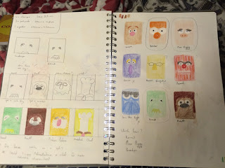
Initial sketches, playing around with different characters and seeing how I can begin to simplify these down and also starting to realise how tiny these stamps actually have to be! 
Lame Animal drawing and some bigger versions of some of my favourite ideas for the stamps
I was really really happy with how the stamp for Animal turned out on the left hand page. I'd added texture like that because Animals pretty wild to look at, theres a lot of colour and material in him as a puppet and I wanted to convey this in my stamp for him. I started to re-work some of my previous designs to have these textured lines of colour rather than just being one block. I was thinking it'd make the stamps look a little more fun than just one solid fill colour. 
Four developed stamps. As far as I'm concerned at this moment, these will most likely be my final design for the stamps unless I come back and start reworking them. At this point I'm thinking that I want to screen print my outcomes and I think if I used a chinagraph pencil to draw up my positives I could still maintain a crayon like texture which would link up to the fun, playfulness of the muppets, add more texture and also link up to the fact that the Muppets is a children's TV show.

No comments:

Post a Comment