I drew up two different designs for my poster. One that work more like a grid and one that was more like a typology poster with vignette images. I was pretty keen on the idea of doing another typology kind of poster so started to develop and simplify characters for that.
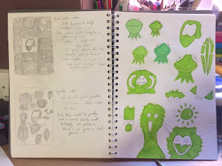 |
| Two poster designs and starting to look at how I can represent characters |
 |
| Typology style Poster design |
I'm feeling really limited with my colour choices. If I'm going to screen print this the easiest way fro me to do it is using two colours max. I went with a bright green because thats what colour Kermit is and jim is mostly associated with Kermit but I think it takes a lot away from the other characters. Henson created this beautifully bold colourful world and I think that's missing from this poster idea. I'm also realising that this is not going to be achieved by screen printing and am considering definitely printing digitally. I think Im going to go for the tiled style poster and leave this where it is. It gave me a lot of insight into working exhaustively and helped me see how I can develop characters by drawing them over and over again but over all this just doesn't sit right with me, it's not communicating the fun playful message that i want to communicate.


No comments:
Post a Comment