Monday 26 October 2015

OUIL404 - Line


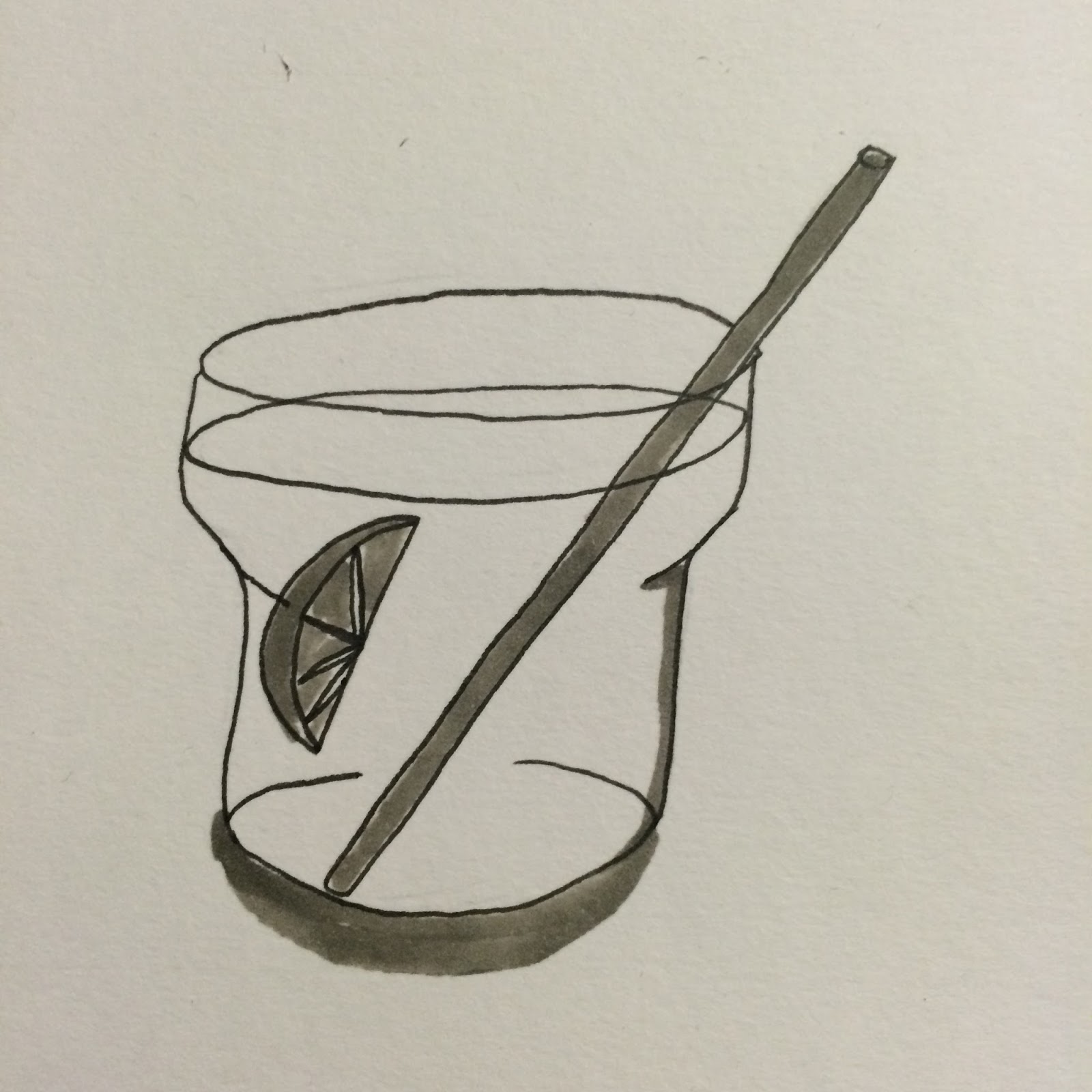
This task asked us to choose a motif/figure/artefact from our visual subject and draw it 20 times, each time with a different line quality. I chose to draw one of the seaweed images for this task because it was quite simple and I thought that that would really give me an opportunity to experiment with line and see how different mediums can work. 


Ink and Brush
I really love the energy created when painting with ink, I think the line quality is fabulous, everything looks more playful and energetic. My lines are still a little feathered and wobbly as I'm not really used to painting but I'm sure with practice I can make this work well!

Ink and Hog Hair Brush
Chunkier brush, looks okay but not really my thing, the brush made it really hard to add detail or get certain shapes and lines how I wanted them, overall I'm not too keen. 

Dip Pen and Ink
Another cool way of applying ink! Love the varying thickness of the line, conveys that same energy and playfulness that you get with using ink and brush but on a more controlled level. 

Copic Pens
These looked okay and the pens were fun to use, I have an abundance of topics but don't really use them, I'm quickly realising that I limit myself in terms of the materials I work with mostly due to being scared I'm gonna screw up. This quality of line was pretty nice, chunky and bold, I much preferred the brush tip to the chisel tip though and I can't say I'm impressed on how much they bled through the pages of my sketchbook. 

Sharpe Fine Point
Bold, controlled line. Easy to use and easy to get down the shapes and liens you want to get down. 

Fineliner 0.2
I have always used fineliners, they are my go to materials, one that I know how to use and am comfortable with using. Unfortunately, you don't get a lot of character in your drawings from them, they're very fine and are useful for detailed drawings but I think they just lack energy. Saying that, I do like the quality of line and can see how it would be useful for some work. 

Fineliner 0.8 and Chinagraph Pencil
The thicker finalisers look a fair bit better I think, I'm quite liking the materials that create this chunky line, and the 0.8 finaliser and the chinagraph pencil both achieved this. I also really like the texture the chinagraph pencil gives, it's very waxy and crayon like but looks great!

Pencil - H, 2H, B, 6B
I didn't realise just changing the type of pencil would have such an effect on the line quality! The H and 2H pencils create very sharp, fine lines where the B and 6B pencil create much chunkier, heavier lines. I really like the 6B drawing, it stands out loads, looks super heavy and thick.

Through this task I have learnt that a lot of different materials can be used to create loads of different line quality, and in turn this line quality could express different ideas and feelings in your artwork. For example, ink and brush can create a playful, energetic feel to your work whilst fineliner might create a more serious tone. 

There are seven primary functions of line

1. To convey its own intrinsic beauty
2. To divide or limit an area or space
3. To delineate a thought or symbol
4. To define form by edge or contour
5. To catch and direct the eye over a given course
6. To produce a grey or tonal gradation
7. To create design or arrangement


Andrew Loomis. 1947

Sunday 25 October 2015

OUIL404 - Sketchbook Task

For this task we were given a list of visual subjects and asked to choose one of them to research and produce a minimum of 4 sketchbook pages of drawings in response to our chosen theme. Out of the 14 subjects we were given to choose from, I decided to go with 'Deep Sea Diving and the Coral Reef'. I chose this theme as I have an interest in nature and learning about different animals and environments and I thought that I would enjoy research and responding to this subject more than any of the others on the list. 


I'm pretty happy with how these turned out, I like the simpleness of some of them, and also the tonal value of the back of the whale and the jellyfish. I really enjoyed looking at shells and seaweed, seeing the different shapes, varieties and colours that you can find in the ocean was interesting, I'm excited to explore this visual subject further!


Friday 23 October 2015

OUIL403 Visual Skills - Typology Final Poster

Final Typology Poster 'The A-Z of Bad Habits' 
Overall I was quite pleased with the final outcome of my poster. I liked the fact that the drawings are in a consistent style and look like they belong together as a set. I also really liked the colour scheme. Even though it was just black, grey and white I thought it worked well with the idea of bad habits. Grey can be quite a dull colour and I think this worked well with the habits being bad rather than good habits. Good habits would have worked better with a brighter colour as they're things that you should be doing, where as the grey works with bad habits as they're usually things that you shouldn't really be doing, or doing that often. I think if i was to change anything it would probably be the layout. Although I liked the idea of the poster being quite systematic and laid out neatly I feel like having the illustrations in more of a cluster and varying the sizes would have made it more interesting to look at. I would have probably also added little sub-titles to the illustrations so that people definitely knew which illustrations related to which letter of the alphabet. Saying that, I do think that overall the poster works quite well and also fits with the mandatory requirements of the brief. Below are some of the illustrations that I think worked best on this poster.

Judging People Too Quickly
Smoking


Drinking Too Much Coffee
Alcohol


Knuckle Cracking
Excessive Yawning


Cursing


OUIL403 Visual Skills - Typology Development

Lip Biting/Cursing
I started to develop my drawings by focusing a page of my sketchbook on each different letter of the alphabet. This gave me a chance to experiment with colour, style and size and also give me a chance to experiment with how I could draw things so I could see what worked well and what didn't. After the first couple of pages I started to fall into a style/colour scheme that was then consistent throughout the rest of my drawings. 


The first page of drawings I did included work that was done in coloured pencil, finaliser and copic markers as well as some that were a mixture of two. I had been experimenting with using different colours and was enjoying working with a dark pink colour but soon remembered that the poster had to be produced in monochrome. I then started to use a grey copic marker to add colour and fill to some of my drawings and found that even though I preferred using the dark pink, the grey also worked well and also fit to the requirements of the brief. 


Not Catching Enough Zzz's/Smoking

Alcohol/Drinking Too Much Coffee
Final A-Z of Bad Habits: 

A - Alcohol
B - Biting Pens
C - Cursing
D - Drinking Too Much Coffee
E - Emotional Spending 
F - Forgetting My Keys
G - Gambling (Scratchcards)
H - Hoarding 
I - Internet 
J - Judging People Too Quickly 
K - Knuckle Cracking 
L - Lip Biting 
M - Making Too Much Pasta 
N - Nail Biting 
O - Over-thinking 
Knuckle Cracking/Questioning Everything
P - Procrastinating 
Q - Questioning Everything 
R - Reading The Last Page Of A Book First
S - Smoking 
T - Not Texting Back 
U - Ummm
V - Videogames 
W - Watching Too Much TV
X - Excessive Yawning
Y - Youtube 
Z - Not Catching Enough Zzz's 


After I'd developed all of my sketches I started to think about layout. I knew that all the individual illustrations had to be set as vignettes or floating spots and also that there had to be a written title. I wanted the finished poster to be in some kind of order so decided to lay my illustrations out in a grid that would allow me to put the illustrations in order of the alphabet while still giving me enough space for a hand written title. 


Overthinking/Pen Biting
Layout Sketch

OUIL403 Visual Skills -Typology Idea Bang

Typology brief: 
Produce an A-Z illustrated typology poster.
Must be produced in monochrome and in A2 portrait format. 

After being briefed for this project the first thing I did was make a mind map to try and get my initial ideas down on paper. I then went on to selecting a few of the themes that interested me most and tried to think of ideas for the different letters of the alphabet for each theme I'd chosen to look into. 


I found it really difficult with some of the themes to think of ideas that related to all of the letters in the alphabet. I also thought that I wasn't thinking of interesting enough ideas and that they should be funnier or more easy for people to connect with. From this initial idea bang I found that the themes of 'Bad Habits' and 'Shitty Tattoos' were working best for me, and were also interesting me more than some of the others that I'd thought of. I moved on to sketching out some of the ideas that I'd had and seeing if that helped me think of more ideas for some of the letters. 
Bad Habits
Weird Looking Animals
Shitty Tattoos
 After working on a few different themes I decided to go with the theme of 'Bad Habits' as this was a theme that I thought I could easily relate too and that other people would be able to relate too as well. I also thought that it was the strongest idea that I had thought of and I was quite enjoying working on the sketches and thinking about how I could develop them further.

Wednesday 14 October 2015

OUIL404 - Photoshop Task


I'm not even going to try and avoid this, I missed the photoshop workshops due to underlying issues and so had absolutely no idea what I was doing. I had a peak on other blogs and had a mess around on photoshop just to try and get the hang of things though. I chose to use my page of mushroom drawings because I was really happy with how these turned out and was excited to see what I could try and do with them. 
Original image, after playing with levels and cleaning up. 

I added different tones of a light brown colour to different sections of the mushrooms, only colour the large on in the middle in full to try and draw the eye too it. I think that worked pretty well and I was happy with how easy it was just to use a simple brush tool to add colour to my drawings. 

Different brush types were interesting to play around with, I had some watercolour brushes that I'd downloaded  ages ago so used these and some different tones of brown to add an background colour/texture. I quite like how this looks, I think it's pretty simple but the brushes make it more interesting to look at. 

I tried to create a more psychedelic image because of the relation some varieties of mushrooms have to being hallucinogenics. Even though the mushrooms I had drawn weren't of this variety I was pretty happy with how this turned out, it looks pretty funky and the brushes i used added to this effect. 
This was just a simple inverse, but I like how it turned out, like I said, missing the workshops held me back bit but I tried to do what I could and create a few different variations based on the knowledge I already had on photoshop. 
 I definitely want to look into using photoshop some more, I think maybe looking at some tutorials online over the next year will help me a lot although I'm not completely sure about whether I'm that keen on using digital media. I'm starting to understand how digital techniques can help to enhance my work but I think it'll take me a little more practice and experimentation to get my head around it and be happy using it.

OUIL404 - Drawing from Observation

To start off with this task I chose and book that was based around herbal plants and their remedies, I really like drawing plants and natural things so took advantage of this task and our plant drawing task in the afternoon. 


I kind of got a little fixated on this mushroom I was drawing and just kept going and going and going. I think this is good though, were always been told to draw stuff over and over again and this was the first time I really got in the zone and stuck with a drawing. I think they look fairly good, I'm really happy with the line quality as well!


In the afternoon I drew a kinda wonky cactus that i'd brought in from home. Can't say I was too keen on how these turned out though, I think the top two work best, the tone and the line quality looks quite expressive and gestural which is what I was hoping for. I really need to push myself to break out of the idea that everything I draw has to be perfect, finished piece. It doesn't. Mistakes are cool. 

I really enjoyed this task, it was quite therapeutic to just focus on one image/object and draw it over and over again, I'd really love to try and do bit more of this in my spare time when I'm out and about or just sat around my flat. 

Tuesday 13 October 2015

OUIL404 - Look, Think, Draw - Observational drawing

For this task we were spending time in and around Leeds, drawing things that we could see in relation to a list of starting points we were given! I really struggled to get into the swing of this. I am too used to creating detailed, perfectly constructed images that show a realistic reflection of what I am drawing. I had to really step out of my comfort zone with this and try and loosen up a little bit. Matt told me to draw as I see and I started to just sketch things out and get things down on paper a lot quicker and in turn was a lot happier with what I produced. 


I was not happy with these weird melty lions we had to draw. They sucked. They were so difficult to draw, because the statues had just eroded so much over time! I really enjoyed drawing the plants in the park though. The sketchy, messy quality of the drawings was really nice to see, I was a lot happier with them than I would have been with something I had slaved over for hours, probably because these just seem a lot truer to form. I can definitely see how obeservational drawing can help improve your relationship with drawing and the world around you, it allows you to get tiny details, scenarios and ideas down quickly and expressively. 

I did not like the Royal Armouries one bit. Everything seemed so cold and hard and metal. I don't like guns and knives, they hold no interest to me so it was difficult to engage with this task. I tried to get a few sketches down of different swords and knives but overall i think my lack of enthusiasm for the subject matter is made visible in my sketches. The Discover Centre on the other hand was super interesting and really fun to look around! It's a shame we didn't get more time in there, I would have stayed all day if I could! Because it was so interesting, I didn't find myself doing much drawing because I was too busy wondering around in awe looking at all the different things that were packed into this tiny room. I did get a few sketches down, including one of a little monkey dude that I really enjoyed drawing. 

These were just some crappy sketches I did while sat outside a coffee shop waiting for a friend, They kind of suck as I couldn't fully engage myself in what I was doing, I get too distracted people-watching while I'm out and about.