I've finally been able to get a start with the visuals. After a lot of jumping from idea to idea with my collaborative partner, we decided it might be best if he steps back a little bit and just let's me move ahead with the visual aspect of this brief. I think this will work a lot better and will help us both speed this process up.
I've noted down some visual starting points and am going to start drawing this week so that i can get my roughs to my partner on Thursday, ready to start developing my final illustrations.
Visual Starting Points:
Ingredients:
- sugar
- cocoa (beans/butter)
- milk
- vanilla
- coconut
- caramel
- toffee
- fruit
- nut
- peanut
- sea salt
- ginger
I could maybe develop a pattern using these ingredients? Possibly using cut paper or maybe lino cut to produce a more handmade, rustic kind of feel

Monday, 27 February 2017
Repeat Pattern Workshop
 Creating tiles to use for repeat patterns.
Need to consider size of product in relation to size of tile.
Open Photoshop
New - Custom Size - Enter Measurements (5 x 5) - 300 dpi
Cmd + R - turns rulers on - drag guidelines on to each side of the tile
Image - Canvas Size - untick relative - percent - add extra 200% - allows room for overlap patterns etc
 view - lock guides
drag first image into document
alt and drag - creates a copy
start to arrange motifs onto tile
select square with marquee tool - edit - define pattern - name and okay
New document - international paper - a3 - ok
create new layer - edit - fill - pattern - select pattern - ok - voila!
add background colour - change colour of motifs (get colour ready, lock with the square/checkerboard lock, alt, backspace)
new document - click the circle icon at the bottom of layers panel - click pattern - can adjust scale of pattern
to save pattern - group from layers - make a folder for them to go in - hide if they're no longer needed - can create new pattern on same document
Using the overlap/extra canvas
drag image onto canvas - alt and drag - create copy - overlap a little bit onto the extra canvas
marquee tool - select the extra canvas that the image is in, go to select tool, hold shift and drag down to bottom of canvas - can also do this with corners, basically just mirror within your tile
To Save
if using edit then fill, you can just save as a layered psd document. Flatten the image first, then save - will make printing more efficient.
If using the other fill option, select the pattern layer and rasterize the continue to save.
You can save the individual tiles as a standard psd file.


Funky.
Saturday, 25 February 2017
OUIL505 - Change of Idea (Again)
So, I've decided to change my idea again after having a quick chat with Ben. I think I've been focusing too much on trying to set out a really defined outcome, and also trying to push myself maybe too far out of my comfort zone. I also realised that I'd been looking at things that did interest me but that I was really excited about making. I had a re-think and decided to jot down a list of things that I actually enjoy learning about or want to learn more about and that relate back to the things that I enjoyed drawing anyway.
New List:
- Native American Culture/Folklore
- Ghost Stories/Haunted Locations
- Tattoos/Tattoo Culture
- Witches/Witch Hunting/Magic
- Folklore/Urban Legends
- Superstitions
Obviously I'm going to do bit of initial research into the subject areas that I've highlighted to give me a bit more direction, I'm hoping that over the upcoming interview week I'll be able to refine my proposal and start drawing and get everything straightened by the time we have our progress tutorials.
Thursday, 23 February 2017
Illustration Friday - Moon

The word I chose to focus on this week was 'Moon'. I'd recently got some of the Kyle Webster Photoshop brushes and wanted to give them a test before using them on bigger pieces of work. I used the watercolour set to add colour and texture to my initial drawing. I also used a wacom tablet whilst editing this image, this was also a new experience for me as it isn't a piece of equiptment that I've used before. I was surprised at how easy it was to use and it didnt take me long to get my head around it. I'm looking forward to experimenting more with this kind of illustrative style in the future.
Monday, 20 February 2017
Software for Packaging Workshop

nets - flattened 3D objects
Illustrator:
- file, new, a3 - can be shrunk down later if needed
- guides, first layer, create rectangle over whole document, object, path, split into grid, set columns and rows to 2

- create new layer, net layer
- alt, click in center, enter rectangle measurements, tada, you have a square in the center of the page


- hold alt, drag box up, down, left, right etc, creates a copy while leaving the
original
- add another square on the will be the lid
- add flaps for glueing by using rectangle tool
- direct selection tool, click one corner, alt, click the other corner, circles let you curve edges
- direct selection tool, alt, copy to sides of the boxes that you need glue flaps on
- reflect tool, click on center line, choose horizontal/vertical, click copy

- select, select all, edit, copy, new layer, paste onto new layer, paste in place, hide layer, window, pathfinder, select all, unite, lock net layer.

-lock net layer and make visible the folds layer, select all, reduce opacity to 15%, select stroke, select dash line

- click arrow next to folds layer, select all, object, group
- long edge and short edge binding - long edge flips from the long side of the paper, short edge flips from short side of the paper
- unlock all layers, artboard tool, name the artboard, alt, click, drag right to create a copy

- create new layer for artwork, file, place, select artwork, link or embed image, remove fill from net to see artwork


- create a new layer, crop and score marks, select pen tool, create lines where folds are needed, you can then hide the folds and cuts layer. folds and cuts layer could be left on the inside of the box as this isnt going to be seen but should be taken off of the outside of the box

- save as ai.
- if exporting, tick use artboards, choose format.
- if exporting, tick use artboards, choose format.
Sunday, 19 February 2017
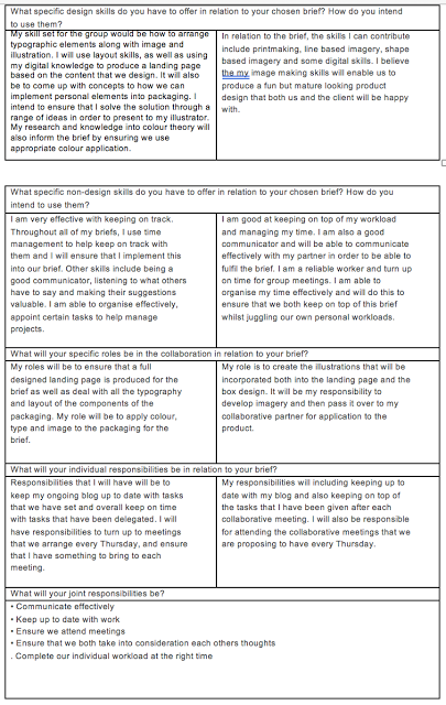
The Grown Up Chocolate Company - Visual Approach Research
Throughout our research and ongoing discussion during this collaborative process, me and my collaborative partner have identified multiple different themes that we could follow through on this brief with. We are struggling to decide how we want to represent The Grown Up Chocolate Company in our packaging and the feeling that we want to give the consumer via our packaging. We've decided to look into different visual approaches/styles individually in order to gain better understanding of where we could take this. We will then be meeting up to collate and review our research and decide on a final route to follow.


Shaped based imagery is a simple yet effective way to make an illustration really stand out. I was drawn to this piece due to its ability to be sophisticated whilst still remain quite playful. I think the elegance is mainly down to the clean cut shapes that have been used to construct the image. The colours used then relax the whole image down a little, giving it a more fun, playful feel. This is also a good way to approach the brief and would fit in well with our target audience. Fun playful chocolate bars for sophisticated adults.


I find this illustration to be really visually striking. The combination of cut paper, collage and hand drawn elements is really well executed and gives off a very hand made feel. I think the combination of all the textures of the different bits of paper that have been used help give the image more depth, rather than just using pieces of flat coloured paper. I think an approach like this would work well with our brief due to the hand crafted look it has. The Grown Up Chocolate company are proud of being a handmade confectionary company, and following this through with handmade illustrations would fit perfectly. I also think the idea of using different scraps of paper could be made relatable to our brief. Possibly taking this approach and using bits of sweet wrappers/gift wrap would be something to look into?


I really feel that collage/cut paper could be a really strong route to go down with this brief. I think it helps that it ties in with The Grown Up Chocolate Company's current use of imagery but allows room for expansion and personalisation, not necessarily just within this brief but also for other products that the company might come out with in the future. I also think that the idea of collage and cut paper could be useful when thinking about the personalisation element of their new product. Would it be possible to create something that the customer could also edit and change? For example if we used collage based illustration, could we make it so that the customer could add their own images into the collage? This is something I will ask my collab partner when we meet up tomorrow.

I've also been looking at how emrboidery is used within illustration recently. This has kind of sparked another idea, not necessarily using embroidery, but more the idea of 'de-facing' an image. I was thinking that maybe we could create a set of 'stickers' or 'filters' that the customer could apply over their own uploaded image. These stickers would be reminiscent of childhood, possibly looking at face paints? This is a past-time that the majority of people would have engaged in when they were kids and it would be fun to let the customer apply these illustrated face paint stickers over the top of their own image. I think this is a route that we could look at following, especially because it connects with The Grown Up Chocolate Company's idea of childhood, they make chocolate that are the same as the ones you'd eat as children, but with an adult twist, so it'd make sense to look into injecting bit of our childhood back into our adult lives in terms of the packaging as well.
I think I've got a lot of different ideas and questions to take to my next collar meeting so I'm going to write them down and make sure they're brought up in discussion so that I can blog about it after the meeting. I'm also hoping that at our next session we will be able to get working on the practical aspect of this brief and start assigning tasks for each other to be working on.
Saturday, 18 February 2017
OUIL505 Mind Maps - What Do I Want To Do
Having swapped over to Retail and Packaging I started trying to make connections with what I enjoy drawing, what I care about, and what I could make. I think going through this process helped me link up a few different things that were going on in my head and helped me put things into context. For example, I've always enjoyed drawing from nature and this links to the interest that I have in our environment. I also have an interest in mental health and wellbeing and feel that i'm starting to explore this more through narrative in my personal work.
Anyway, I made some initial connections from that first mind map and identified three different themes:
. Wellbeing
. Environment
. Animal Welfare
I've started to try and develop these initial thoughts into a more structured plan in order to be able to complete my project proposal. I feel like I'm going to go down the route of environment/animal welfare as I feel this has more context and opportunity for development. I also feel that wellbeing/mental health/positivity has been touched on a lot recently and I run the risk of just creating things that already exist and not really being able to come up with any 'original' content. I'm going to fill out my project proposal and then hopefully the feedback from that will help me decide what exactly i'm going to try and achieve. I'm still worried that i've chosen the wrong area to work within and now i'm feeling like I should've stayed in adult publishing. The one thing this module has taught me so far is that I am very indecisive.
Tuesday, 14 February 2017
The Grown Up Chocolate Company - Confectionary Specific Research
I found a packaging website called Lovely packaging that had a section dedicated to confectionary packaging. I found it really useful to look through this because along with pictures of confectionary branding/packaging, there were statements from the companies/designers on why they had chosen to use certain elements in their design and how this related back to brand values.
I particularly found the packaging for 'Moonstruck Fortunato' to be aesthetically striking and the concept behind the design to be very strong. The packaging takes inspiration from the location in which the company is based and incorporates architecture, landmarks, nature and some folklore into the imagery. To me this promotes that idea of handmade/locally produced goods. Having a strong connection in your packaging with the identity/location/morals of the brand is a good way to create packaging that has a strong concept and is executed well.
From this research I've started thinking about how we can tell the story of The Grown Up Chocolate Company through the packaging that we have been asked to design. Although the personalisation of the chocolate bars is key in this brief, the packaging leaves for other options to be explored. We already know that The Grown Up Chocolate company is a small, bespoke business, operating in the Harlow area of London. We also know that The Grown Up Chocolate Company creates chocolate bars that are reminiscent of chocolates we ate as children, with an adult twist. Is there a way that we can incorporate the things we used to do as children, or the things we wish we could still do as adults into the packaging design? Is there a way that we can bring the origins and roots into our packaging design? And if so how would we do it? These are questions that I will bring to my next meeting with my collaborative partner.
Retail and Packaging Research
I had a quick look through the presentation that the Retail and Packaging group did and identified a few different areas that I'm going to research into myself. These include paper products, homewares, packaging, murals and textiles.
Friday, 10 February 2017
Illustration Friday - Teeth

I've been rejecting Illustration Friday recently, mostly because I'm stressed with other work that I've got going on but also because I'm finding the themes that they choose for each week quite boring and uninspiring to work around. I wanted to give Illustration Friday a go as a way to expand my digital skills so I'm still going to commit to getting some more done, but I'm going to be working with words that they've used in past weeks as a pose to the ones that are being put up at the minute.
The word I chose this week was 'Teeth'. I created a rough sketch, refined it with black ink and then scanned it into photoshop. I changed the colour and the duplicated my image to give a kind of 3D effect, then using simple shape and graph paper, I created a background for my image. This was simple and kind of quick but it's still helping me become more comfortable using Photoshop.
Adult Publishing Presentation
Doing the research as a team was a lot of fun and enabled us to cover a lot more in our research than if we'd been left to do it individually. I slept through my alarms the morning of the presentations so couldn't make it into uni on time to present with my group. Even though I learnt a lot from the research I struggled to find anything that really inspired me and I'm still not sure that this is the right group for me to be working in. Also, having just done the author brief and a brief for the Penguin Book Awards, I'm kind of sick of working on book covers feel it would benefit me and my practice to start exploring different avenues. I originally wanted to look at Retail and Packaging and think I'm going to do some research into this to help me decide where my interests lie.
Thursday, 9 February 2017
The Grown Up Chocolate Company - Collaborative Meeting 09/02/12
Today me and my collaborative partner met up to go over the progress we were making on our project. Ste told me that Graphics had a talk from YCN and they mentioned that the projects that did best tended to be the ones where people had pushed the brief further and done more than expected/asked from them. From this we spoke about possibly expanding our project and rather than just looking at the packaging and landing page, we could possibly look at incorporating other things into our project such as extras within the packaging, web/mobile ideas and a way to get customers to return or further personalise their experience with The Grown Up Chocolate Company.
We've also decided to separately research different avenues that we could go with this project and then share them with each other next week and choose a final theme/style that we want to carry forward for the project. After this we will be able to give each other set tasks and start to develop the work further.
We've also decided to separately research different avenues that we could go with this project and then share them with each other next week and choose a final theme/style that we want to carry forward for the project. After this we will be able to give each other set tasks and start to develop the work further.
Wednesday, 8 February 2017
To Kill A Mockingbird - Submission

I've submitted! I'm really glad this brief is done and out of the way now. I really enjoyed working on it but it's good to be able to finish everything off and submit the cover so I can get working on the next brief.
To Kill A Mockingbird - Final Cover

I'm really happy with how my book cover has turned out. After seeing the cover on it's own I was bit skeptical as to wether the design would work as a whole but now i've completed the whole thing I think the design really works and effectively communicates the themes and ideas that I was wanting to communicate. I think the colour palette works well and that the contrast between the illustrations and the cover text works inline with the different themes that run throughout the novel.
I need to run through everything and make sure it's all set to be submitted but then I think I'm ready to submit. I've got to admit, actually submitting it seems terrifying. I think because I'm sending my work to someone outside of uni, there's a bit more pressure than just submitting for a standard module hand-in. I think that's the reason I've been putting responsive off for a while as well, sending your work off to actual professional people/companies is slightly terrifying.
Tuesday, 7 February 2017
To Kill A Mockingbird - Colour Choice and Cover Mockup

This is my mock-up of the front of my book cover. I've chosen to have the floral illustrations in the background a mixture of light pastel tones because these are the colours that camellias usually are and also because the lighter, pastel imagery links up with the themes of innocence and childhood. I kept the monotype text black as it's a stark contrast to the lighter tones of the illustration. Likewise in the book there are darker themes of racism and prejudice that run alongside lighter themes of childhood and innocence. I kept the background a neutral image because I didn't want to distract from the main image and text.
I'm pretty happy with how things are going for this brief. I like the composition of the text and the imagery and think these elements compliment each other. The only thing I'm worried about is it looking a bit plain or empty? I don't know, I just feel like as a stand alone image it's not quite there yet. I think mocking the whole book cover up and adding the spine, back cover and all of the additional elements will make the image feel more complete.

Monday, 6 February 2017
The Batsford Prize - Bird Research

Giant Ibis
"This ibis has an extremely small population, which has undergone an extremely rapid decline as a result of hunting, disturbance and lowland deforestation. It is likely to continue to decline extremely rapidly, owing to on-going deforestation and human disturbance. It therefore qualifies as Critically Endangered."

Kakapo
"The kakapo has been extirpated throughout most of its range due to habitat destruction and predation. Its slow reproduction rate and elaborate mating system, which probably served as a useful natural population control when there were no predators, have only sped its demise."
 Kagu
Kagu"Sadly, following predation by dogs and habitat loss the Kagu is now listed as Endangered. The Kagu experienced a decline in numbers during the 1900s primarily due to predation by invasive species. Domestic dogs have historically been the main threat to the species along with cats and pigs."

Forest Owlet
"Unlike most of its nocturnal relatives, this owlet is diurnal, hunting lizards, birds and rodents in daylight hours. Whilst surveys continue to discover more individuals, habitat fragmentation caused by the continued loss of deciduous forest is likely to result in a further decline in this species."
 Philippine Eagle
"Among the rarest and most powerful birds in the world, it has been declared the Philippine national bird. It is critically endangered, mainly due to massive loss of habitat due to deforestation in most of its range. Killing a Philippine eagle is punishable under Philippine law by 12 years in jail and heavy fines."
 Sumatran Ground Cuckoo
"Whilst little is known about the species it may well be in decline due, primarily, to deforestation. There are currently a number of protected sites within the Barisan Mountains some of which overlap with the range of the Sumatran Ground-cuckoo"
The Batsford Prize - Why Birds
I think I've figured out that I want to focus on birds for this brief for a number of reasons. Firstly, when I was younger I was a member of the RSPB (Royal Society for the Protection of Birds) and have a bit of a soft spot for birds through some of the things i learnt from being a member. I have vivid and fond memories of doing the annual birdwatch with my grandad in his back garden, where we'd sit and identify different species of birds and tally them up on a chart that would then be posted back to the RSPB, in order for them to try and look at populations of different birds species. Since then I've had a little soft spot for birds and conservation and feel that it's something that would fit this brief well. Combining that with the fact that birds are funky and pretty fun to draw (for me anyway), I think this is the route that would be best for me to go down.
I've started my research by looking at endangered birds and the reasons why they're endangered:
Giant Ibis: hunting, disturbance, deforestation
New Caledonian Owlet Nightjar: 'mysterious', only 50 adults, rarely sighted
Kakapo: hunting, introduced species, deforestation
Kagu: dogs, habitat loss
Forest Owlet: habitat fragmentation, habitat loss
Philippine Eagle: loss of habitat, deforestation
Bengal Florican: habitat loss, agriculture, illegal hunting
Christmas Island Frigate-Bird: ants, habitat loss, pollution, phosphate mining
Sumatran Ground Cuckoo: deforestation
I know this is only a small bit of research but I was honestly shocked at how often 'habitat loss' or 'deforestation' popped up. All of the birds (except the Owlet nightjar, which is apparently just a mysterious bird) are endangered due to deforestation and habitat loss. I think it's shocking because sometimes the only reason some of these birds are endangered is because of our own selfish actions in damaging their environment for our own sake. I think I should do some more research on each bird and wittle it down to a smaller list. I also think I'm going to start roughing soon and think about how I can combine these birds and their habitat loss into one image.
The Batsford Prize - Brief Analysis
I've decided to have a shot at entering the Batsford Prize for a number of reasons. Firstly, the brief is very open ended brief, with Batsford looking for entries that show 'innovative and well-crafted' interpretations of nature. They ask that the work should reveal something about nature and our relationship too it, leaving a lot of room for different ideas and takes on this brief. I also chose to work on The Batsford Prize as the environment and nature are something I already have a strong interest in and that i try to reflect into different parts of my practice. I previously chose Margaret Atwood as my author for OUIL504 and this was mostly due to her environmental activism and how this spanned throughout her life and work.
I'm not entirely sure which route I want to go down with this brief yet, after all there are a lot of different avenues to explore, I'm hoping to look into habitat loss and/or conservation mainly, but will have a bit more of a think and decide once I feel better informed

The deadline for the brief is the 4th of April so I feel this will be easily achievable as well as balancing other ongoing modules. The theme for this year is Interpreting Nature and should reveal something about nature and our relationship too it. A submission form is available online and the work should be submitted via email (this is also provided online). Only one piece of work is allowed to be submitted and should be supported by a artists statement of 500 words.
The Grown Up Chocolate Company - Updated Timeplan

Hopefully this revised timeplan and the 'Todoist' app will allow us to be a lot more efficient with our time planning and will help us keep track of our individual and collaborative progress.
The Grown Up Chocolate Company - Todoist App
This weekend we downloaded an app called 'Todoist'. The app allows you to create joint to-do lists which we thought was a perfect way to keep each other up to date on the progress made in between group meetings. The app allows us to add and complete tasks and keep a conversation going about our project. It let's you know what tasks need to be completed by a certain date and how your collaborative partner is doing with their workload. It also lets you assign tasks to each individual which helps us see who needs to do what.


I feel like this app will really help us keep on top of the brief and keep track of our own individual and collaborative progress. I also think this app will be useful to me personally and help me keep up to date and on track with other modules.
Sunday, 5 February 2017
Research into Adult Publishing
I've done a little research into book covers to try get a feel for this brief, I've found some stuff that I'm really interested in and some really great examples of illustrative book covers. It's made me warm up to this sector of Illustration bit more, but I'm still kind of sat on the fence.
To Kill A Mockingbird - Lino and Mono Printing
After I'd chosen which design I wanted to push forward, I cut my lino and headed down to the print room. Lino printing is something I think I've developed through previous modules and believe that combing lino and mono printing would create an interesting outcome that reflected both the innocence and the darker side to Harper Lee's novel. Whilst I was mono printing my type, one of the print room technicians came over to me and suggested that if I wanted a creepy, childlike effect on the type that I try writing with my left hand. Mono printing is hard enough considering you have to write everything backwards so doing this with my left hand was even harder. It did produce some really childlike type but was abit too warped and distorted for what I was aiming to do. I've chosen one of the cleaner lino prints and some clearer type to take forward and develop into my book cover.
Subscribe to:
Posts (Atom)