Tuesday, 10 January 2017

Screenprinted Outcomes

Over the last two days I've managed to get all five of my prints done with no hiccups except a little trouble aligning the two colours when adding the final colour to the prints. This means I've only got a few 'perfect' copies of each design but I quite like where some of them have misprinted.
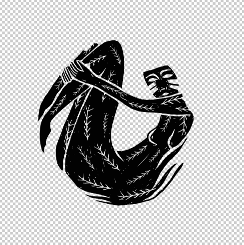
I usually hate screen printing because nothing ever seems to be straight forward for me. I think the fact that I'm a short person and I can't reach the back of the printing beds and apply the right amount of pressure on the larger printing beds has really messed up my print process before but this time I used a smaller screen and a tabletop printing bed so the whole process was a lot easer and a lot quicker for me.


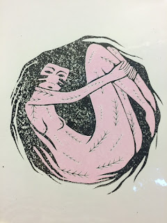
I also really think my confidence with screen printing has improved dramatically over this module. There are a lot of things that can go wrong when printing like this but after stripping multiple screens, coating them and printing with them, I'm feeling a lot more comfortable with screen-printing as a process and think it's definitely something I'd like to re-visit.

Friday, 6 January 2017

Change of Format

I had a quick chat with Shelly in the studio this afternoon and she pointed out that because I'd moved some of the circles towards the top of the page in order to fit the image on, they weren't working together because not all of the circles were centred on the page. She suggested that I work in a portrait format in order to make sure I could centre all the image on the page while still allowing room for bits of the image to come out of the circle. I printed some tests out and cut them down to 30x40cm and they work a lot better. It allows me to have enough space for for the images to be centred and the images now work a lot better as a set.
I'm going to start screen printing on monday, and have already cut the majority of my paper down to the new size so hopefully once the screens are exposed and ready to go, getting them done and finished should be a fairly quick process.

Thursday, 5 January 2017

What am I doing with After Effects

I haven't really given much thought too after effects, I've been too busy printing and figuring that out and as usual, the whole digital aspect of making an animation is scaring the crap out of me.
I think I'm just going to try and run with one of the first storyboards I made for the storyboard task, most probably the leafy/jungle lady one, that one seems pretty simple and straightforward, I don't think that'll be too difficult for me to do.
Also going to keep the sound super simple and find some copyright free nature sounds online and just drop that in over the top of the animation. I kind of feel like I've let myself down for leaving this part of the module so late on to try and sort out but I'm feeling really happy with where my prints are heading so that kind of makes up for the lack of time I've put into my animation.

Wednesday, 4 January 2017

Screen Print Positives

These are my positives for my final prints, hopefully I'll be able to get these printed pretty quickly and start getting on with my animated stings. I've got a feeling the print room might be quite busy considering how many people might still need to get their printing finished off so I'm going to give myself a bit of time and say that I'll get these done my next Tuesday at the latest, hopefully it'll be done quicker than that but at least I've got the time to sort them out just in case things are moving a little slow. Tomorrow I'm going to have a look at different stocks and decide on what paper i want to use and get this cut down ready to print on. I also want to try get the positives printed out either tomorrow or Friday morning and then I can get down to the print room. 

Pink
Black


Pink
Black
Pink
Black
Pink
Black
Pink


Black

Print Development And Final Set of Mock-Ups

After the crit I had a quick chat to everyone on our table and they suggested pulling all my designs together to see if they sat well together. I quickly mocked this up and after showing them the designs I'd chosen to print, they quickly pointed out that the leafy print had a lot more black in it than any of the other prints and that it would be better if I changed the colour of some of the leaves and maybe the mushrooms, still keeping the depth of the image but spreading it out a little more evenly over the whole print.
Initial Print Set

I decided to re-do the colour placement on the leafy design and am a lot happier with how they're looking as a set now. I think the next step is too separate my prints into different layers, ready to print off as positives for screen printing. 

Final Print Set 

Crit Feedback

My crit proved really useful in helping me make up my mind about colour and where I should apply it. I don't have any of my animations ready or started really, so I only had my prints to talk through but I was quite happy getting a bit of direction on them. People said that the pink colour worked best and that i should just stick with two colours across the whole set of prints, so from this i've decided my prints are going to be black and a pastel pink colour. I also wanted to know where I should apply certain colours on my knife print and the leafy print.
I've decided to apply colour to the cheeks and knife of this print. When I only did one or the other it left a lot of white space and left the design looking like it needed more adding to it.


I decided to keep the black texture in the mountain for this design as without it, the print looks empty and unfinished, this was also mentioned in my crit. 
For this print I've decided to keep the colour in the foreground and leave the background black. This adds more depth to the image which I think this one needs as its so busy.

Tuesday, 3 January 2017

Print Mock-ups And Thoughts on Colour

I was going to upload all these images to issuu so it was bit easier to look at but it wouldn't let me upload the file so I've just had to stick them all on here.
Over christmas, one of my main tasks was too combine my lino prints with my mono printed textures and then start to look at colour choices and how these could be applied too my prints. I've mainly looked at applying pinks and greens as these represent Atwood's feminist and environmentalist views. I wanted to wait till after we got back to uni after christmas break to make a final decision as I has some conflicting thoughts on wether to use the same two colours throughout my set of prints or wether I could mix it up bit and use some different colour combinations for each different print.


Personally, I think that the pink and green tones work best rather than the red/blue/yellow colours that I've experimented with. I think they both work well across all different prints and will tie everything together quite well. I'm bit stuck on where I want too apply some of the colour and this is mainly with the knife print and the leafy jungle print. I'm not sure wether I've got too much or too little and think I'm best just waiting for my crit and seeing whats preferred when people look at my work with a bit of outside perspective.