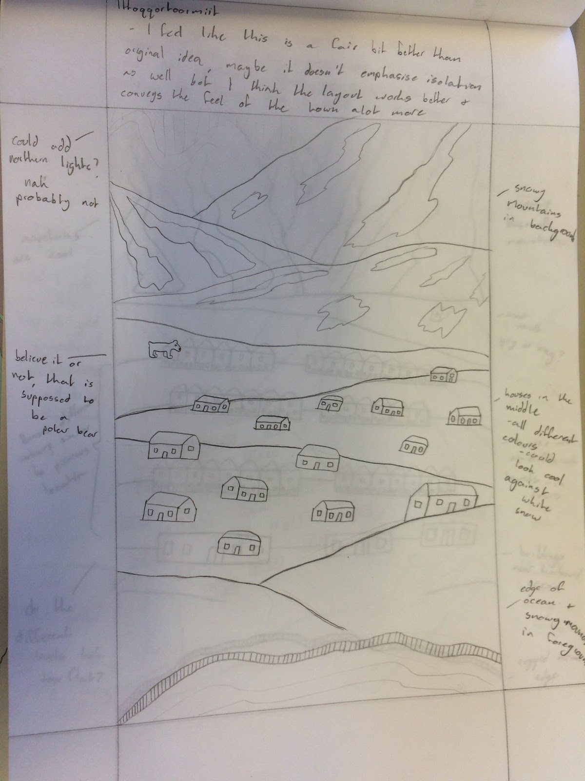
I must say i'm a lot happier with how these roughs have turned out. Visually, I prefer the look of them and think that the composition of the different elements on each postcard is a lot better thought out. Unfortunately I don't think they communicate the theme of isolation as clearly as the first set of roughs did.
 |
| Ittoqqortoormiit |
 |
| Longyearbyen |
 |
| La Rinconada |
 |
| Supai |
In terms of compositional elements, I really tried to focus on the landscape to make the environment that surrounds these places and the idea of isolation more clear. I think this worked in some of them, I especially like the rough for La Rinconada, you can see the mountains towering over the city and have a sense of depth and perspective with the mountains layering up over each over. I also think high canyon walls in the Supai postcard work well in terms of dwarfing the town below it. Once again the houses/towns are bigger than I want them to be. As much as this brief is based around cities, I think the landscape around these cities/towns should be highlighted more.
I'm really not sure which set of roughs I would prefer to take onto illustrator and develop further. I have my pin-up crit today so I'm hoping that after that my thoughts will be a lot clearer and I will be able to make a good decision on which roughs to develop into my final postcards, based on feedback from tutors and peers.


No comments:
Post a Comment