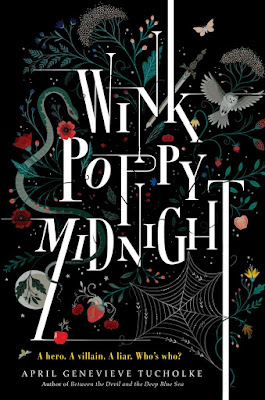
Lisa Perrin
Lisa Perrin is an illustrator whose work covers a varity of formats but also works on book covers for different novels. Her work mostly consists of shape based imagery, using line and texture to create depth and add character and detail. Her work is slightly surreal, and carries a slightly darker tone of voice whilst still being appealing and aesthetically pleasing. I like the way in which Perrin uses shape based imagery and then adds detail in using a variety of line and texture. I feel that this is an approach that maybe I could take with my own work as I feel it is a kind of illustration that could appeal to a wide audience.
Marissa Johnson
Marissa Johnson is an illsutrator and designer who applies her illustrative work to textiles and printed fabric. Her work consists of shape based imagery, texture and mark making in order to produce pieces of work that have depth and integrity to them. I particularly like her application of colour, this is soemthing I struggle with and I find it inspiring to see a relativley simple colour paletter that is cohesive but that also allows the focal point of the imagery to stand out. Her use of texture as a background further helps the imagery stand out. I think texture is something I would like to be incorporating into my work more as a means to give it more depth.
Tallulah Fontaine
Talllah Fontaine is an illustrator who's work has been applied within multiple contexts. Her work ranges from retail and promotion to publishing and editorial. I've noticed whilst looking through her website that Fontaine maintains a consistent visual aesthetic but depending on the brief and context, this may differ slightly, wether it's in terms of colour palette or image composition. I feel that this is something to remember whilst working in different contexts or trying to work within one. There are certain considerations that have to be taken into account but this doesnt neccesarily mean you cannot communicate a tone of voice. Additionaly, the colour palettes throughout her work and subtle use of texture are a beautiful combination that strengthens her work as a whole.
Bryn Perrot
Bryn Perrot is an illustrator and woodcut artist. Her wood carvings have been used for beer labels, band merch, shops signs and collaborations with t-shirt companies. I find her work particularly striking because of both its simplicity in terms of colour but also it's intiricacy using shape and line. I find it inspiring to see illustrators that work primarily in black and white, this is usually my go to, so it's nice to see proffessionals who use black and white imagery as their main method of image making. I also particularly like the high level of detail achieve using line. Her work isn't so much over-complicated imagery, at face value it may seem quite simple but the detail and character conveyed via the use of line is wonderful.
Camille Chew
Camille Chew is an illustrator who's work addresses the themes of mythology, fantasy and the occult. Her product range is limited and mostly consists of prints of her many illustrations. Although maybe her work doesnt sit in a wide variety of contexts already, I believe her work is something that could be applicable to more than one area of concern. Her use of clean shape and line is a good contrast to the rough textures used in some of her backgrounds. Through this combination she manages to convey a darker tone of voice, linking to her interests in fantasy and the occult. I feel that making imagery relevant to the subject matter and that conveys the theme visually is something that is important to remember whislt undergoing this module.


No comments:
Post a Comment